
How to use Flaunt UI
To use the component you can import the style sheet in your css file or add the link in your html file.
Alert
Alert provies an user interaction's feedback message on screen
The alert component has four types - success, error, warning and info
Alerts are available for any length of text.
Alert
Avatar
Avatar displays picture or vector form used to show the display picture of a user.
The avatar component has three types of different sizes- large, medium and small.
Avatar Image

Avatar Badge
Badge on Avatar can displays the status of a user i.e Online, Offline, DND.
Avatar Badge
Item Badge
Badge on items shows the count of selected items when user selects one or more items.


Button
Button defines a clickable event whether to submit any action based on user's requirement.
General Buttons
Icon Button
Outline Buttons
Disabled Buttons
Card
A card is for onboarding messages that need a more flexible layout or to display data about something like a product on Ecommerce website.
Card Text
Vertical Card
Note: To add showdaow effect to card, add the shadow class in the parent div.
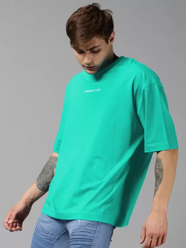
Shirt
Rs. 1619 Rs. 2699 (40% OFF)
Card with Badge
Trending
Shirt
Rs. 1619 Rs. 2699 (30% OFF)
Card with Dismiss
Trending
Shirt
Rs. 1619 Rs. 2699 (30% OFF)
Card with Text Overlay
Trending
Shirt
Rs. 1619 Rs. 2699 (30% OFF)
Horizonntal Card
Trending
Shirt
Rs. 1619 Rs. 2699 (30% OFF)
Quantity:
Simplified Grid
Grid component has two types Two column grid, and Three colummn grid
Two column Grid
Three column Grid
Input
Input component allows user to input information like Email-Id, Password, and other information
Standard Input
Input with Validation
The input validation component has three variants success, error and warning
Note: To use warning and success validation replace class error with warning or success
List
Lists are continuous, vertical indexes of text or images.
Unordered List
- List Item 1
- List Item 2
- List Item 3
Ordered List
- List Item 1
- List Item 2
- List Item 3
List with Icon
Modal
Modal adds dialogs to your website for lightboxes, user notifications, or completely custom content.
Standard Modal
Navigation
Navigation bar is used to navigate through the web app or websites.
Standard Navigation

Rating
Rating components are used to review something like rating a product or an item.
Standard Rating
Note:To add the color to the star add the class checked and to increase/decrease the size use fa-3x, fa-4x and so on.
Text Utilities
Documentation and examples for common text utilities to control alignment, wrapping, weight, and more.
Typography (Heading)
Note:Typography titles have different size than the regular size for heading element for h1 fontsize is 64px and line height is 48px, for h2 fontsize is 40px and line height is 32px, for h3 fontsize is 32px and line height is 24px, for h4 fontsize is 24px and line height is 16px, for h5 fontsize is 16px and line height is 8px,
Top level heading - Title 1
Second top level heading - Title 2
Third top level heading - Title 3
Forth top level heading - Title 4
Fifth top level heading - Title 5
Typography (Text)
Note:Typography text have different size than the regular size for heading element for h1 fontsize is 64px and line height is 48px, for h2 fontsize is 40px and line height is 32px, for h3 fontsize is 32px and line height is 24px, for h4 fontsize is 24px and line height is 16px, for h5 fontsize is 16px and line height is 8px,
This is top level paragraph - Para 1
Second top level paragraph - Para 2
Third top level paragraph - Para 3
Forth top level paragraph - Para 4
Fifth top level paragraph - Para 5
Toast
Toast displays notification to a user.
Standard Toast
Toast can appear on any four corners of the screen or at the bottom center of the screen
Add the class bottom-left, bottom-right, bottom-center, top-left or top-right accordingly